--
Senior IC and design consultant for Aviva’s ION design system and public websites.
--
/ What is the ION design system?
ION encompasses Aviva's UX, Design and Front-end atomic component library. It is a reusable, responsive web component library and front-end CSS / HTML code base.
Used by global digital product and engineering teams, it helps to deliver consistent and maintainable experiences for our customers and intermediaries.
/ What does it consist of?
ION is a living breathing atomic design system which powers over 120+ live sites across Aviva's digital estate. With integrated brand adapted for a digital landscape, it has been a best in class documentation website (awarded by Axecon 2022) complete with live component visualisers and a component library over 320+ components. This is then paired with an extensive Figma component library which is optimised for product teams and their individual work streams for day-to-day usage.
My role has been a key part of its significant growth in and around the business since 2018, taking ownership of the design of key components, new patterns and its advocation within product team usage and the wider business.


" My focus as a senior design IC is essentially in four key areas. The creation, optimisation and enhancement of:
1 | Accessible and globalised components.
2 | Component library.
3 | Design of the Aviva standards and ION website.
4 | Providing creative direction for product teams and designers."
/ The Aviva standards website.
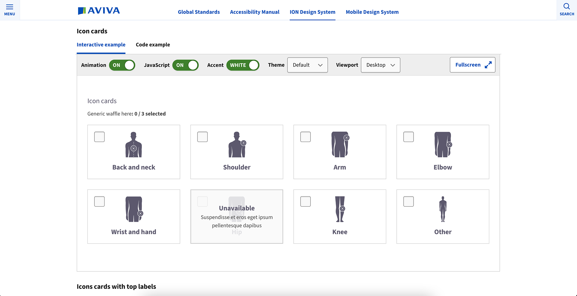
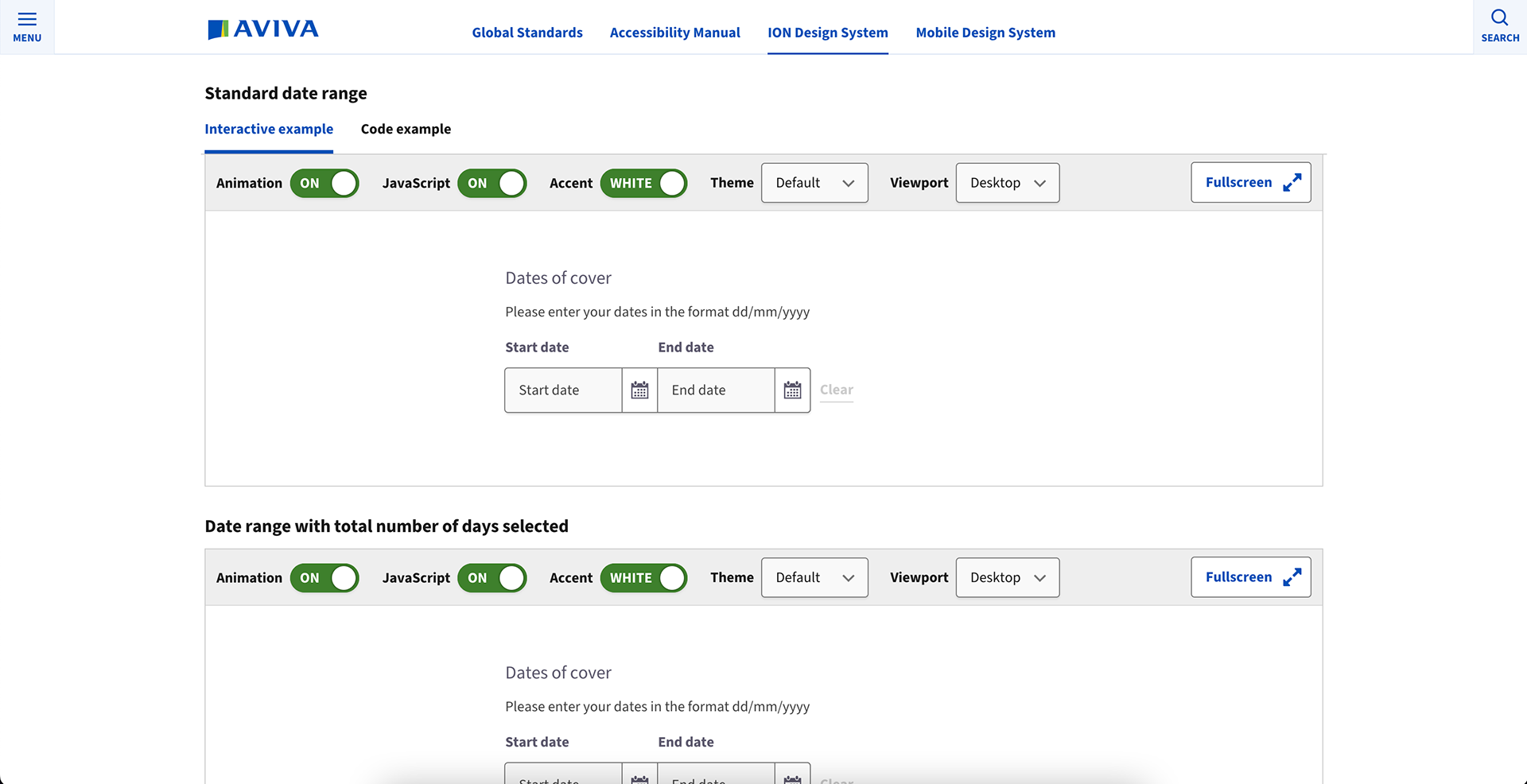
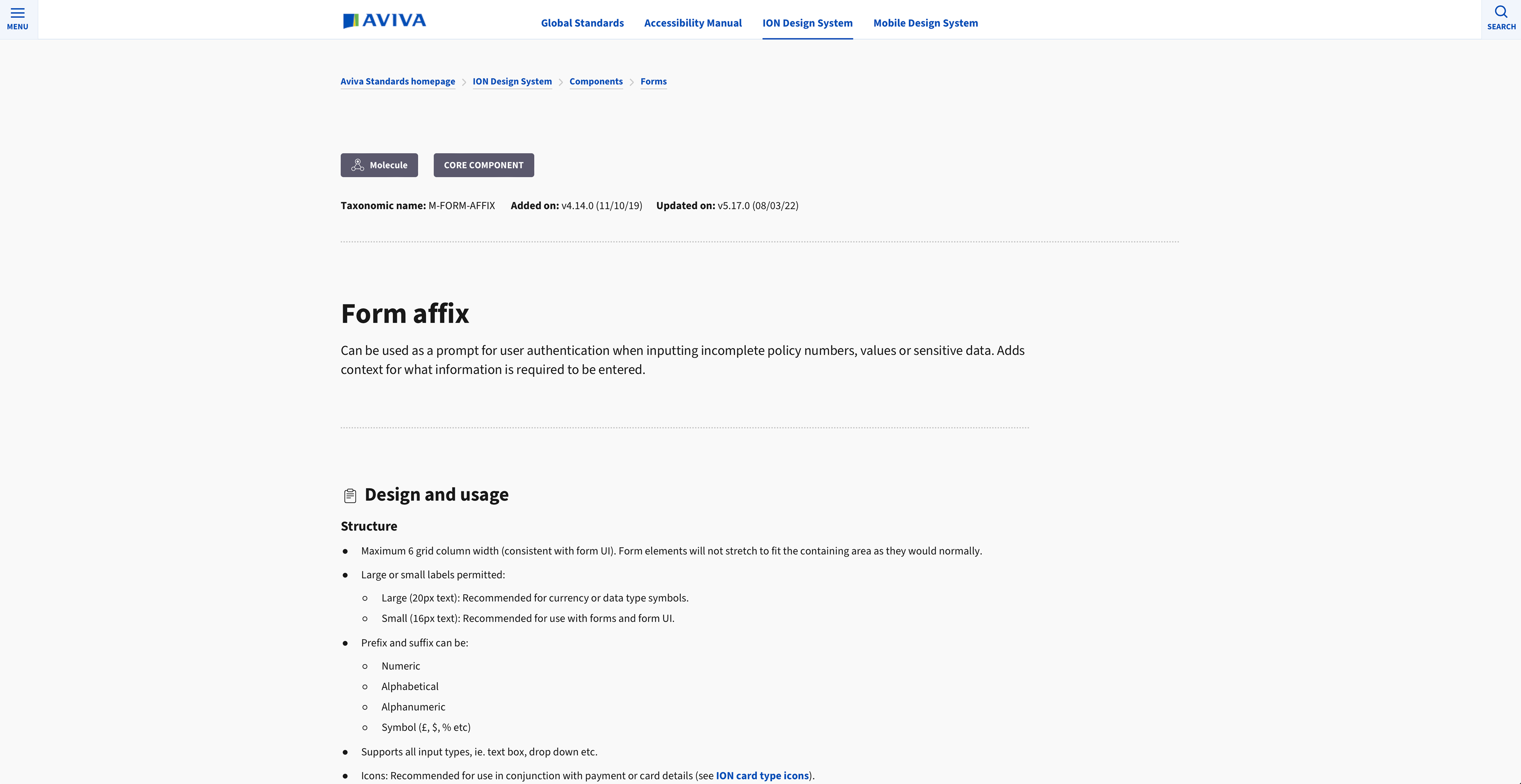
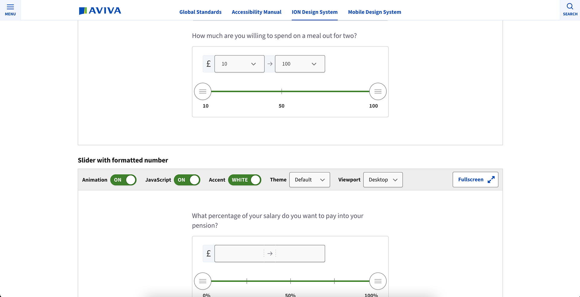
The ION documentation website is a single source of truth for global standards, design system components, usage guidelines and general patterns and templates. As a 'best in class resource (Axecon - 2022)', it has accessibility baked into its functionality and design. Collaboration between user research, design and development is at its very core.
"A best in class resource".
| Axecon 2022 |
/ Figma component master file.
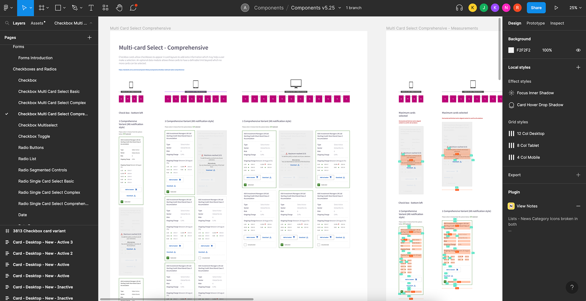
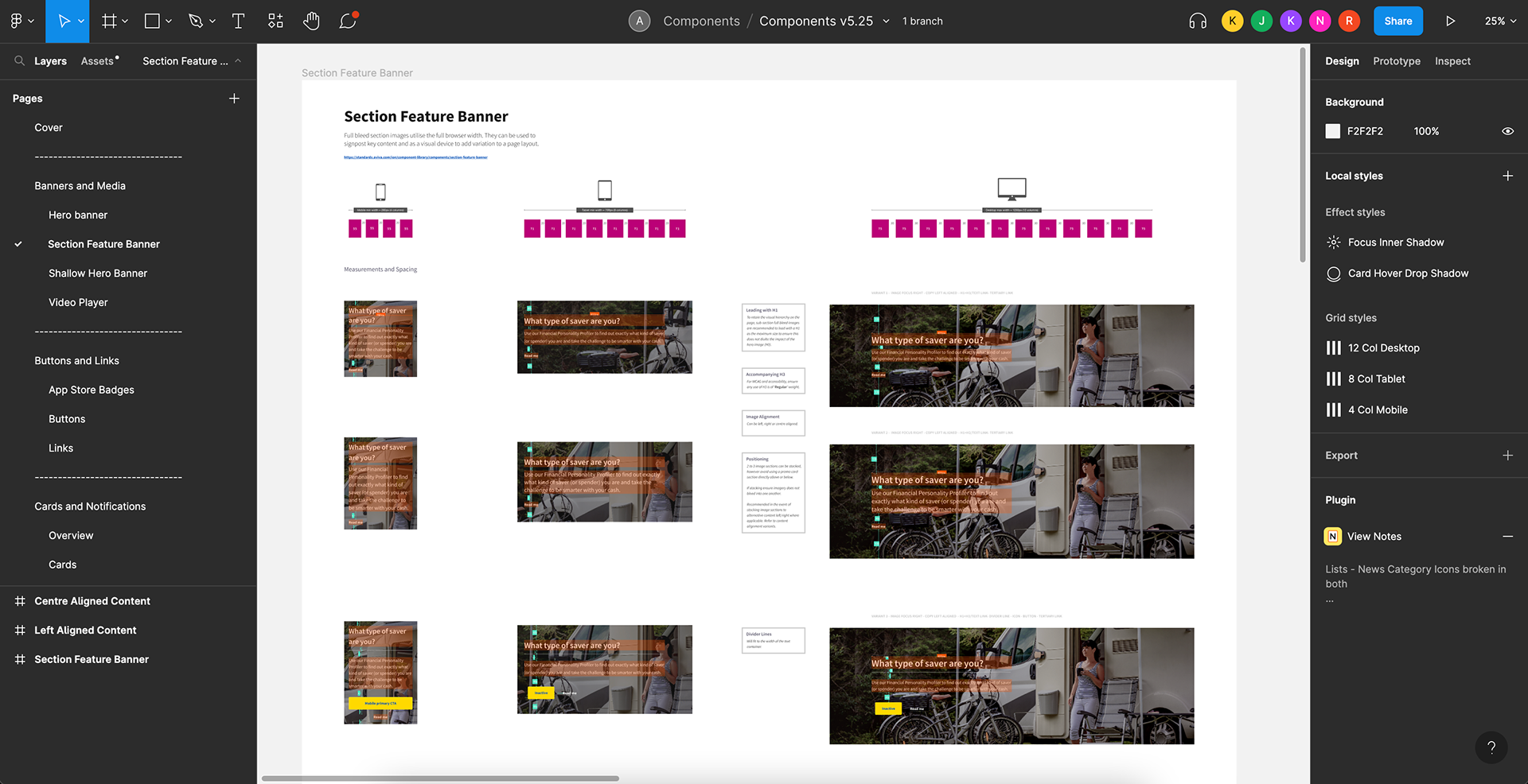
The design system is accompanied with a suite of master design files. The component master file houses every design asset for every component and pattern. This is optimised for Figma usage permitting designers to utilise on-the-fly changes between component states and relevant variants. With usage guidelines baked into each one, this helps to remove ambiguity in terms of their design anatomy, specifications and contextual usage.

/ Style guide and iconography.
The style guide consists of colour palettes, common grid structures, typography and font detail. It also includes any rules around vertical spacing from a template point of view. This is part of the design system which helps to govern global rules around form, function and styling. System iconography contains design system wide icons for use in components, websites and also marketing material.
--
Case study: Brand expression
A new Aviva brand and design system adoption.
Aviva required a new brand expression update which would scale across the organisations digital and offline estate. The project's prominence would be far reaching and a reflection of Aviva in 2025 to both customers and shareholders (B2B/B2C). The major intention was to be industry leading in terms of its digital compliancy, accessibility and from a creative standpoint. The ION design system was core to this delivery.
"For the business, this was the first of its kind in terms of a brand expression update which at its core included design system level thinking and accessibility baked in. Not an after thought.
Projects of this magnitude for a company Aviva's size requires it's own adaptability as a designer for its implementation. Taking ownership of this on behalf of the ION design team required understanding of what the external agency had been already briefed to do. My role was to then understand, consult and advise on best practice for the company across UI, UX, visual design and accessibility. It required calling on the full repertoire of design expertise as a senior design IC.
"A rounded understanding of UCD, the ION design system and comprehensive design practitioner expertise was integral to its delivery across all digital touch points"
/ Consulting on brand thinking.
As part of the core delivery team for the organisation, consultation and collaboration across varying levels and disciplines formed the basis of the working group. From initial kick-off meetings, my role was to communicate the ION design systems influence and direct the external agency to appreciate and integrate the existing framework and established successes.
From my point of view, it was case of identifying the maximum impact in terms of the agency's output to the value it would provide to the business pointing them to design system components which had a higher impression rate (identified via internal knowledge and DOTs team). This was a decision made to ensure a view of potential cascading visual changes required for the wider component library. 7 components were identified with this uniqueness.
" Ensuring the agency and the brand expression were digitally led was of paramount importance to the business. Especially to ensure all brand and visual identity were deeply considerate of design system compatibility and its holistic level touch points."
1 | Weekly check-in's with the agency.
2 | Providing accessibility and design direction.
3 | Regular internal stakeholder sessions.
4 | Fortnightly combined team alignment calls.
In addition to the above, involvement for the wider technology and implementation teams needed to be informed and consulted. Factoring this in to ensure any potential bottle necks were identified early was important. For the next phase of integration into ION, all public websites and what would also influence another key organisational delivery for the year was unification into the mobile app space. This responsibility required identifying, managing and ensuring close working relationships with key personnel.
The ION core delivery and AEM teams were key to the adoption of the brand expression into the design system and across all public websites. Having key involvement allowed an holistic view of how and where things would change and to help plan and resource its deployment across Aviva's digital estate.
/ Design system adoption.
With 7 components initially adapted with the new brand expression thinking applied, next steps included refinement and enhancement where required. Creation of these needed to be optimised in Figma including all associated variants and properties in each design asset. These were all created. In addition to this, documentation was also of importance. This would form part of the wider guidance on usage rules for both developers and designers.
" After handover to myself, close collaboration with core DS team, resource, development and planning were key. In addition, it was now the opportunity as a senior IC to apply and adapt the initial established patterns where required to the wider design system.
Essentially a license to evolve, define and lead the design rollout."
Working closely with project management and business analysis, the key components were broken down and tracked using an agile methodology. Responsibilities were to assist in breaking these into JIRA tickets alongside a project planner tracking the entire component library. This allowed a focused effort within a sprint delivery format (2 weeks per sprint). It also enabled sourcing and directing additional design support down the line in terms of updating the remaining ION components ready for build. In summary:
1 | 7 key component enhancements.
2 | Creating new patterns and design logic where applicable for new variants.
3 | Optimising existing components and patterns.
4 | Daily scrum updates communicating with core development teams.
5 | Testing of new components within controlled live environments.
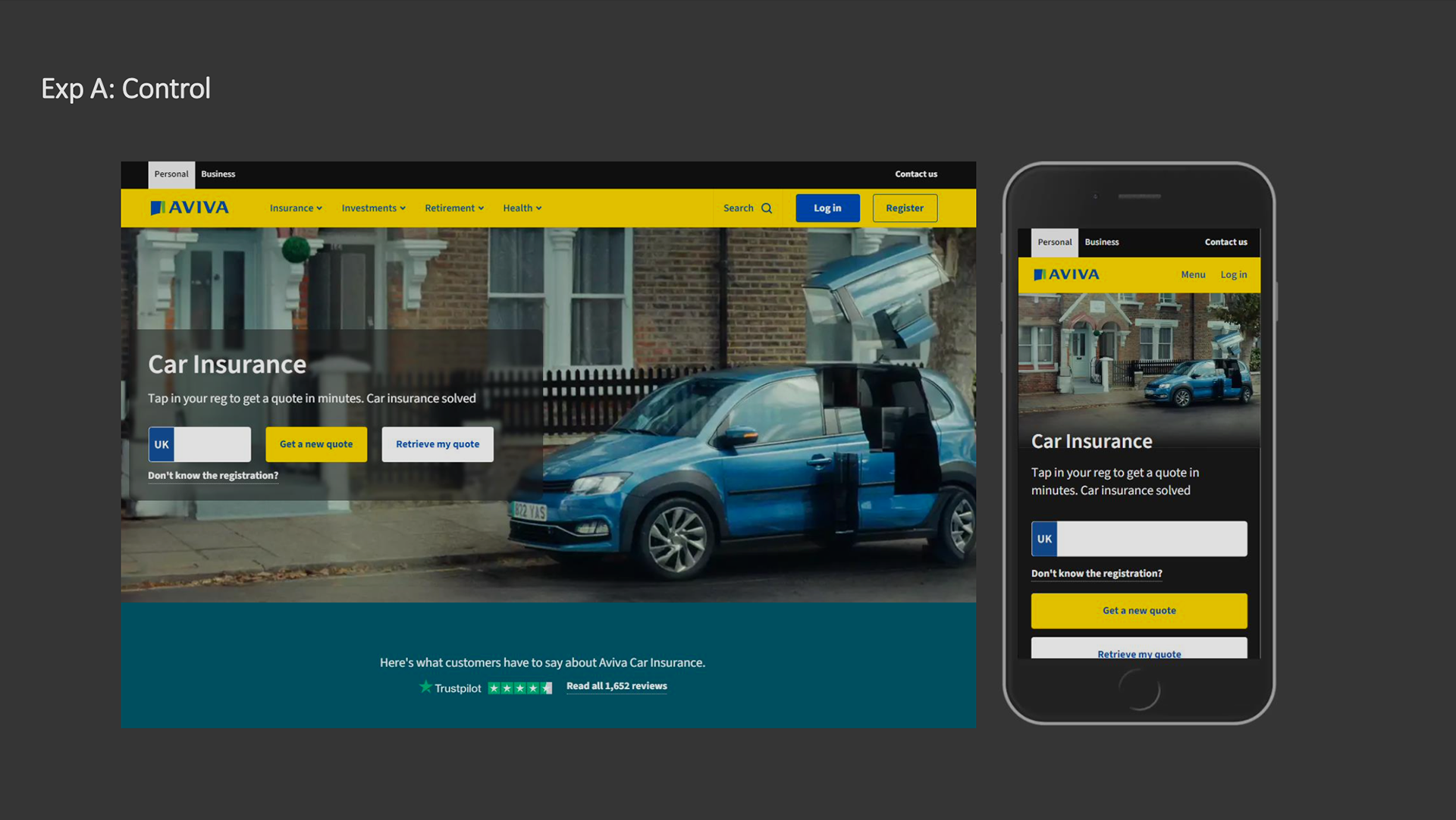
/ An example: Hero banner.
A/B testing.
Steps were taken to test the high profile and prominent changes appearing particular components. This was accomplished within a controlled live test - A/B. This was to be able to address any potential drop off's in user engagement and if necessary review the design of the component. My role was to co-ordinate the DOTs team and the ION developers to be able to assess this:

/ Component library.
Figma, variants and documentation.
Creation and adaptation of the existing components in Figma required relevant skills as an IC to understand what would form a variant to their distinctive properties. Deciding on what would be of use based on their usage guidelines and use cases helped influence this. Each component has required its own unique set of parameters. The opportunity also presented itself with the ability to streamline and optimise particular patterns and their variants.


Unification: Web and Mobile app
Another key work stream for the company was unifying the web and app experiences. This was a large project undertaking which over the years had resulted in a combination of disparate components and elements. With the over arching intention of 'One Aviva' being of importance the brand expression updates would play a leading part of the design language to bring these together (e.g. buttons).
/ An example: Buttons.
Support and communication.
Ongoing support, documentation and workshops were required for designers and the wider business. Activities planned for 2025 include identifying the optimal way of delivering these. Working with the team lead and the wider UCD team, my role was to help establish how the core ION team could help facilitate this. In summary these activities were planned to be:
1 | Update the standards website and all component pages. Communicating these updates across the UCD team and beyond.
2 | Updated and streamlining all Figma files for a V6 breaking change release.
3 | Providing documentations for new joiners and inductions to the team.
4 | Planning fortnightly walk-in's for designers for resolving queries and providing project support for product teams and designers.
--
/ Project skills.
